
Sunday, February 20, 2011
Plan B: College Diet
This week's comic in the East Texan! You'll probably want to click on it to see it full size, the writing is very small.

Thursday, February 17, 2011
UCD Portfolio
This coming fall semester will hopefully see me accepted into the Design Communications program in Dallas. I will have completed my two years of foundation courses and will spend my last three years of my Bachelor's degree at UCD learning all kinds of cool illustration doo-dads.
It's not an open invitation, though, I have to turn in a portfolio with specific requirements by April 8th to be reviewed and hopefully accepted. The first piece I want to work on is my self-portrait...the topic is "self-portrait with container." This container can be visually defined by us; meaning you can go from drawing yourself holding a cup to drawing your reflection in it, because technically it's still you with a container.
One of my first thoughts was saran wrap. I thought it would be cool to convey my face distorted by the wrap because it's clear and viewers will have to think about what it is that's changing my face, and it might even be portrayed as the paper itself being the "container" and me trying to get out.
The first picture posted is my...favorite? So far I have only had one small shoot to experiment with, and I may or may not shoot more because I feel like these pictures will do the piece justice. I just have to decide on one now.


Thursday, February 10, 2011
Advanced Drawing Series
I'm taking Advanced Drawing this year, and the point of this class is to come away with a unified portfolio of five to seven pieces. Many art majors at this point - including me - have taken foundation classes, but have studied technique more that worrying about the outcome of pieces. By the time we're sophomores, and even juniors, we surely have some quality pieces, but as a whole our portfolios are weakened by the extreme variety. For this class, we came up with a solid "theme" to our portfolios, with proposals and everything.
Mine consists of six to seven huge pieces (about 38"x48") of people yawning.
I hope to get a variety of people's faces yawning and draw them with vine charcoal, and the size will hopefully give a more powerful impression upon my audience...because there will be an audience. We hope to have a student show of everyone's portfolios by the end of the year!

Tuesday, February 8, 2011
The East Texan: Christmas
Just as I drew a series for Halloween, I drew a series of six when Christmas rolled around. I got to use one color, so it was either going to be green or red. I chose red because I like red better and I thought it would print well. I also had to be thinking of other religions' celebrations during December; there were columns explaining traditions involving Hanukkah and Kwanzaa as well as the Christian Christmas, so I drew both of the representative menorahs.


Hanukkah

Kwanzaa
Other than those, I had a jolly good time drawing other toons involving the Christmas spirit and I hope you enjoy them!

Putting this into context...we live in Texas. Even though we're getting a cold front with snow and ice (!) now, in December this last one was pretty witty, I thought.
Monday, February 7, 2011
The East Texan: Halloween
As staff cartoonist, I also get to enjoy drawing for holidays and editorial cartoons. My first big assignment was our Halloween spread, and I completed six drawings for it, three of which appeared in print. I really loved drawing these and I explored the more squiggly style, just because I wanted to I guess. I just thought it would be fun at the time, really.


I have two colored versions that I did in Photoshop one day when I was bored, and I plan on practicing on the rest of them, too. It's good exercise with the shading tools and everything, and I like how they turned out!


Frankie here appeared down the middle crease of the spread.


I have two colored versions that I did in Photoshop one day when I was bored, and I plan on practicing on the rest of them, too. It's good exercise with the shading tools and everything, and I like how they turned out!


Sunday, February 6, 2011
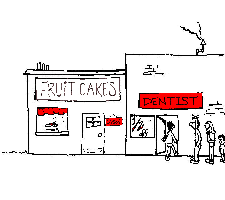
The East Texan: Plan B
We're getting up to speed with my actual works-in-progress!
I have been dubbed the Staff Cartoonist of the East Texan school newspaper as of October, and as such I get to draw editorial cartoons as well as a weekly comic strip collaboration with my fellow comic artist, Bradley "Death" Ray. By "collaboration," I mean that Brad draws comics all the time and yet when he heard of the position on the paper he...told me about it. I was confused, because whereas I'm an art major and all, he's the one who is constantly drawing his little demonic doodles and toons in class. So, when I talked to the editor, I suggested we both work on the comic strip and go every other week.
Technically, I have a bi-monthly comic strip if you look at it that way. So does Bradley "Death" Ray. We call it Plan B. To keep it unified week by week between our different drawing styles, we decided upon a central theme: the average life and events of a college student. Fairly unoriginal concept in general, and I think of it as our version of the comic strip Zits (look it up), but that doesn't make it boring or we wouldn't do it. Although it is proving difficult for me to stay away from puns.
I will be updated my comic strip every other week, but here are my comic strips that have been published in the paper thus far in my blossoming career move, in chronological order. They're in black and white because 1) that's what the newspaper says because 2) our color printing sucks anyways.
Click on them to view them larger! (and to be able to read them...)


This one may need a bit of explaining. It wasn't published, because the week after Halloween was Brad's week to post, so by the time mine came around costumes would be a delayed reaction in...November. But I made this anyways because I enjoyed it. The first costume is Lindsay Lohan in her notorious ETSU (East Texas State University) t-shirt. This shirt caused a huge uprising from alumni from the current TAMU-Commerce University, and they didn't want her being a "role model" of their alma mater. It's easy to take their side, if they hadn't kept constantly telling her to take her shirt off and give it back.


This is for this week's issue of the East Texan. To put it in context, we have been hit with a cold front and consequently we have had ice and snow everywhere (which is a miracle in Texas), no school for three days, and rolling blackouts. This is a reaction to the latter.
Saturday, February 5, 2011
Photography and Figure Drawing
First of all, I loved my photography class, and during the course of the semester we kept blogs. We updated as we learned about other photographers and as we worked on assignments. I only uploaded a few of my photos for the assigned blogs, but I'm going to go back in the near future and post more of my work. Whether I keep updating new work depends on whether I keep up photography as a hobby, but we'll see where that goes. The blog is http://idmpmamcmahon.blogspot.com and it is also under my Links section.
On to figure drawing. It's kind of a touchy subject to many people, especially people who aren't art majors or artists in general, because, well, it's about drawing naked people. Contrary to popular belief, figure drawing really isn't awkward as you get used to the environment and the situation you've been thrown into because these credits happen to be required for your major. Of course the first sitting will be awkward, especially when the model is being politely - and untouchingly - situated into position by the professor. Drawing saves the moment. I'm not sure who you are or what you do, but most everybody has had the feeling of complete concentration and involvement, so much so that surroundings don't really matter anymore. When I - and many other artists - draw, what I'm drawing is hardly some naked stranger any more than it is a contour of a shoulder, or the shading of a knee. The subject matters, but not because of what it is, if that makes sense. It's just a different way of "seeing," I suppose.
Anyways, awkward has nothing to do with anything when it comes to figure drawing for me anymore, and I'm not about to go posting pictures of naked people I drew all over the internet. Granted, the model is unclothed, but I'm not going to share any gory details, just as I hardly drew from that perspective in the first place. All of these drawings happen to be of the male model, because he was very good at sitting still and did most of the longer periods of drawing, and because he has less to hide in a drawing, if you know what I mean.
We began with a long sitting, with the model next to a skeleton. The exercise was to understand the anatomy of the bones and muscles underneath so we draw with the correct proportions and see how joints are constructed if we get confused with what we see.

Working with pencil was my favorite, because we "learned" how to crosshatch [even though many of us had already practiced this concept].


On to figure drawing. It's kind of a touchy subject to many people, especially people who aren't art majors or artists in general, because, well, it's about drawing naked people. Contrary to popular belief, figure drawing really isn't awkward as you get used to the environment and the situation you've been thrown into because these credits happen to be required for your major. Of course the first sitting will be awkward, especially when the model is being politely - and untouchingly - situated into position by the professor. Drawing saves the moment. I'm not sure who you are or what you do, but most everybody has had the feeling of complete concentration and involvement, so much so that surroundings don't really matter anymore. When I - and many other artists - draw, what I'm drawing is hardly some naked stranger any more than it is a contour of a shoulder, or the shading of a knee. The subject matters, but not because of what it is, if that makes sense. It's just a different way of "seeing," I suppose.
Anyways, awkward has nothing to do with anything when it comes to figure drawing for me anymore, and I'm not about to go posting pictures of naked people I drew all over the internet. Granted, the model is unclothed, but I'm not going to share any gory details, just as I hardly drew from that perspective in the first place. All of these drawings happen to be of the male model, because he was very good at sitting still and did most of the longer periods of drawing, and because he has less to hide in a drawing, if you know what I mean.
We began with a long sitting, with the model next to a skeleton. The exercise was to understand the anatomy of the bones and muscles underneath so we draw with the correct proportions and see how joints are constructed if we get confused with what we see.

Graphite

Graphite

We also worked with conte, which I have grown comfortable with from my other drawing classes, so I feel like I did fairly well with not having to concentrate so much on technique as much as the figure and proportions. The first one is a favorite of mine.

Conte

Thursday, February 3, 2011
Drawing II
My second semester of college, I had 3D design and Drawing II. Even though I'm sure it was important to my "artistic growth," 3D did nothing for me and I would have rather spent my time elsewhere, but drawing was one of my favorites. Drawing is what I know and what I do, and even though I'm currently trying to master charcoal, pencil is where I started and it's what I'm most comfortable with using. Without further ado:
We had various assignments throughout the course, but these assignments were more like creative challenges, where the professor gave us a general idea of what we were going to achieve, then left it to us to figure out how we would achieve it. These "idea generators" have since helped me through other creative challenges.
One idea generator is a photo roulette. Flip through magazines, newspapers, books, and find three random images. The challenge is to fit them together within one piece, whether they are merely woven with design or become narratives within each other.


Last is my favorite, the incidental design. Looking around, there are many unnoticed designs and patterns, and I'm not talking about your couch or curtains. I'm talking about the wires hooked up to your television, the array of dishes piled in your sink, or the texture on the toes of your chucks. I chose pencil shavings.


We had various assignments throughout the course, but these assignments were more like creative challenges, where the professor gave us a general idea of what we were going to achieve, then left it to us to figure out how we would achieve it. These "idea generators" have since helped me through other creative challenges.
One idea generator is a photo roulette. Flip through magazines, newspapers, books, and find three random images. The challenge is to fit them together within one piece, whether they are merely woven with design or become narratives within each other.

Graphite - Charcoal - Gesso
Another idea is to transform an object, in any way. This could range from physically altering it, making it unrecognizable, changing its properties (allowing remote controls to fly, for example), among many other solutions. I was flipping through National Geographic, and saw a picture of a person with water pouring over his head, and decided that I would transform his face into a candle, changing the flow of water to appear as melting wax rolling down his face.

Graphite - Charcoal
One concept that I had difficulty thinking of ideas for was the narrative. It's simple enough to understand a narrative as you look at a piece of art, even if it ends up different than what the artist intended. When people look at a piece of art, they see it through a cloud of their own experiences, memories, and knowledge, but to deliver the piece of art to for them to speculate upon and wonder what your intention is...it's a strange thing. It goes from being the one making the art to standing in your audience's shoes and making sure they understand where you're coming from.
Narratives are a wild beast for me to tame, if looking from this perspective, and pondering this assignment left me with the mind frame of drawing something so open-minded that people can shade it in with what they think it means, rather than choosing the meaning myself.

Graphite - Acrylic
Last is my favorite, the incidental design. Looking around, there are many unnoticed designs and patterns, and I'm not talking about your couch or curtains. I'm talking about the wires hooked up to your television, the array of dishes piled in your sink, or the texture on the toes of your chucks. I chose pencil shavings.

Graphite

Tuesday, February 1, 2011
First Semester
Not much can be said for my art courses my first fall in college because they were more about technique than turnout. My drawing class focused on stills and using conte and my color theory class focused on the application of the paint and color matching. Basically, this post will be filled with finished pieces that I favor.
First, from Color Theory:
This is a monochromatic version of Salvador Dali's Galatea of the Spheres. It was definitely a challenge, but I really enjoyed working on this.


First, from Color Theory:
This is a monochromatic version of Salvador Dali's Galatea of the Spheres. It was definitely a challenge, but I really enjoyed working on this.

We then moved on to mixing complementary colors, and I chose orange and blue. Who knew that when properly mixed they would turn into pretty greens? I didn't, but I enjoyed their seemingly magical properties.

Since we were more comfortable with mixing colors-and actually getting what we wanted-we worked on color matching. All we had to do was go to the DIY paint section of Walmart, choose 15-20 colors, and match them. We got to paint whatever we wanted this time, and I think that mine turned out okay, when ignoring the background.
The last project of the semester, we reverted to the basics. Red, blue, and yellow. And black and white to cheat a bit. The pointillism project was by no means a terrible challenge, but it definitely tested patience and changed our dependence on q-tips forever.

I have much less to show from my drawing class, because even though I learned to use the materials, I had no finished products at all other than the few pieces that weren't still lifes. The only still life I want to show you is one that I really like that I cropped off of the whole, unfinished image. I was pretty proud of the way the handle seems to come towards viewers, which was a lot more difficult to convey that I thought it would be.

I don't have much to show other than unfinished still lifes except for two drawings of my hand that we did as exercises of form, value, and contrast using pencil. In the second one, we had to hold an object, so I got a little toy rooster.


Et voila! My first semester in college...even though it yielded few results.
Subscribe to:
Posts (Atom)